Leo Richter’s Portrait by Daniel Kehlmann / for Zeit Magazine
This is Part 3 of a series of posts discussing the process and final illustrations for this assignment.

Good to be back! As promised, here is the 3rd and final post for the ZEIT stuff I did a while back.
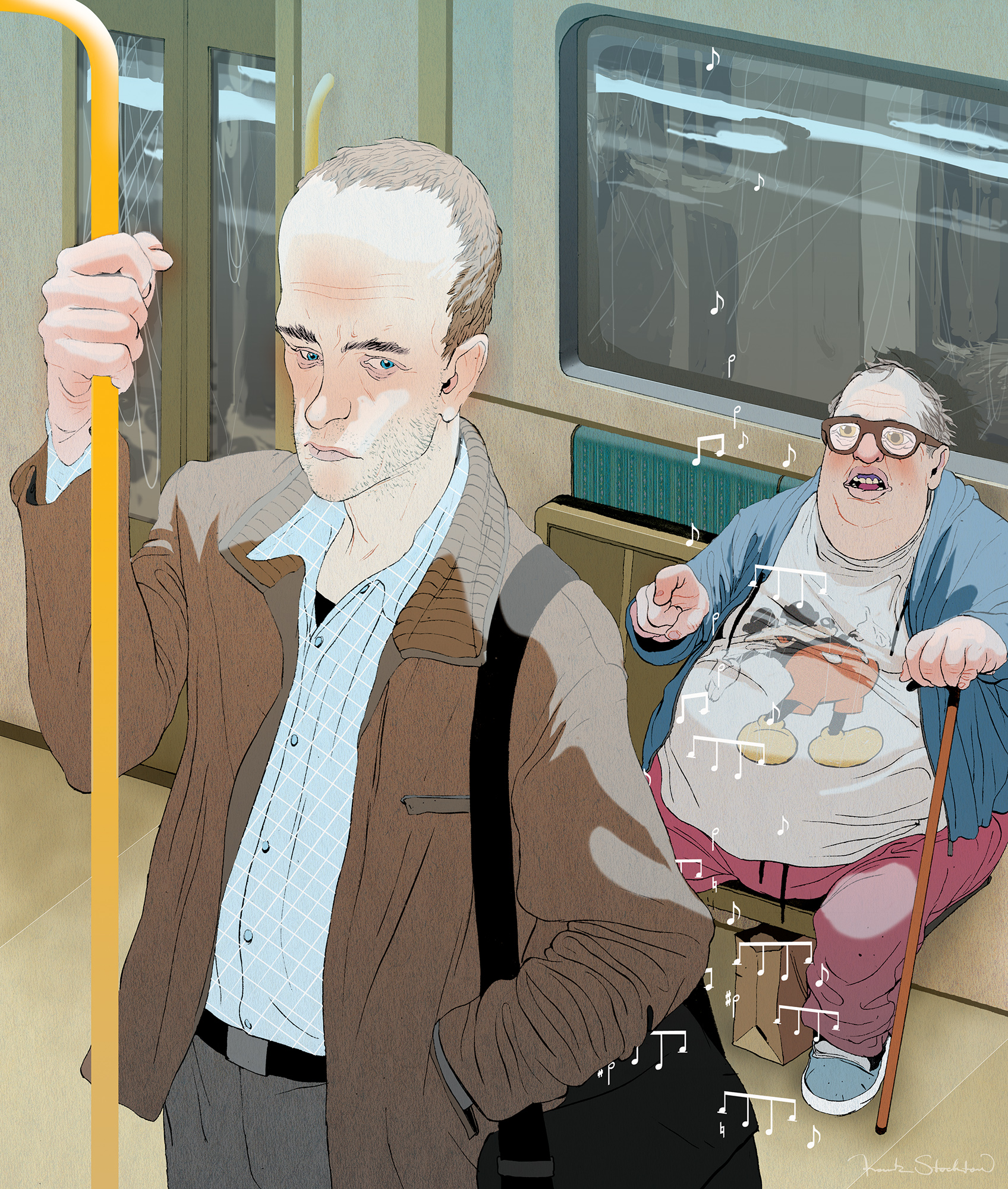
This third piece is a moment from the story where our main character is getting a phone call on the subway train. The guy on the bench is supposed to be someone generally familiar to us all; that odd fellow who is generally ignored by society that makes you a bit uncomfortable to be around.
Drawing weird characters like him is really fun. After I finished this guy I realized he looks a lot like the character from my comic Hamburgers for One (STILL unpublished). However, my hamburgers for one guy isn’t as creepy as this old man is.
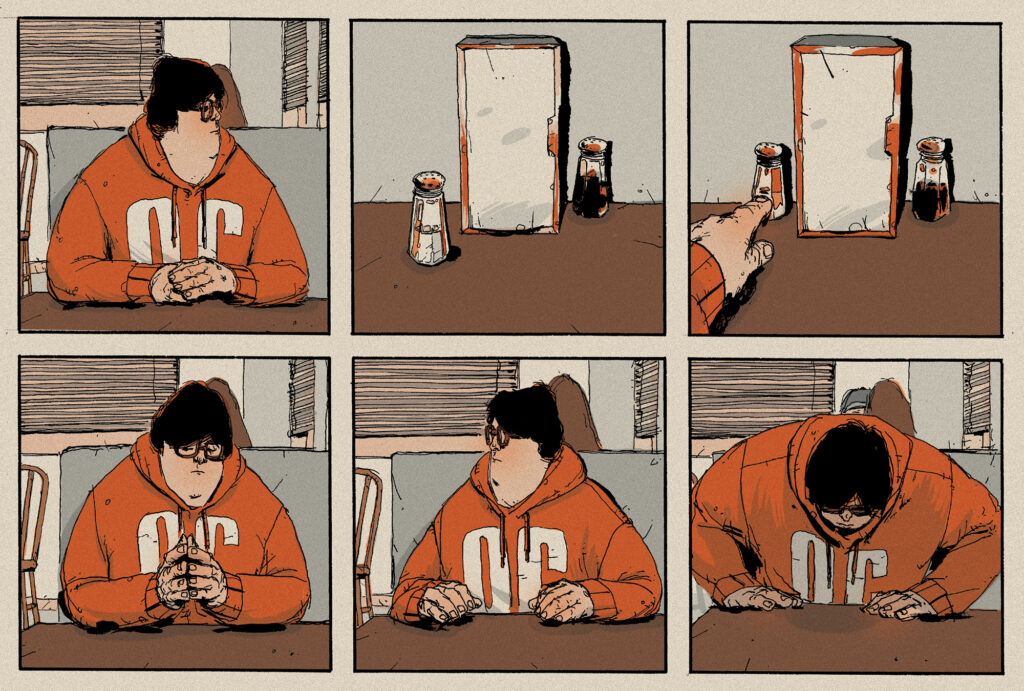
Also, I got the idea to give him a Mickey shirt from this sketchbook page from a few weeks ago:
As a quick note on how I think about character design: I usually think of someone I know or someone I have met or am familiar with. Starting from that angle, a lot of questions are usually automatically answered. For example, a character like this tubby fellow is living a sedentary lifestyle, so naturally he’s going to be overweight, wear comfortable things like sweat pants and oversized t-shirts, and have messy hair. I find that if you can answer the question in your mind of “who is he/she?” then it’s hard to get it wrong.
More from this assignment:
Part 1 • Part 2
A.I. PARTY
Last Thursday was the annual American Illustration bash. As usual, a fun time was had by all. I got the privilege of meeting a few illustrators I’ve admired and never met, and some art directors I’ve worked with but never actually seen face to face.
One person I was excited to meet was Marcos Chin. Marcos is one of the big name illustrators from recent years that I look up to. He’s also one of the coolest, most honest people I’ve ever met. If you don’t know his name, you’ve still likely seen his work around.
Another person I got to chat with was Chang Park, an amazing painter who also has a reputation as a great teacher at Pratt here in New York and MICA in Baltimore. Chang is one of those guys who has been successful in the illustration world a long time and has done great work while managing to stay humble. I should learn a thing or two from him…
Thanks for reading!
-frank

9 Comments
Add Yours →awesome work sir! love the composition and the micky mouse dude’s expression is well captured. great advice regarding character design too!
finally frank! i have been waiting for your posts! lots of work man? hope you keep the way up! number one is now free! so go for it! btw, thanks a lot for your email like a year ago, i have recently started my career as illustrator, and all your advices were really good!
hope to see more!
Fer
http://www.vfernando.com
Great illustration as ever. I really love your comic stuff. Have you had any published. I would like to have some. Maybe you could self publish as you’ve started selling prints 🙂
This comment has been removed by the author.
Sweet illustration Frank as usual, I really like the music notes to suggest his ringtone. I laughed a lot at the remark about the goofy guy with the mickey mouse shirt lol.
Have you ever explored using 3d rendering along with 2d coloring? Check this guy out I stumbled upon last week you may find his work interesting.
http://thehiddennook.blogspot.com/
I believe he uses Maya for his environments on some of his illustrations. Anyway, you met my friend from school, Kumweng at the A.I. party the other day, I wish I would have went but I’m so broke when I heard it was like 20bucks to get in I backed out :/ ahh cant wait for more stuff!
-Steve
Thanks guys, glad the blog is helpful to you. I’m sorry about being a week late on posts. I’ll be back on track next Monday as well.
As far as comics go, no, not published yet, but a short story of mine is going to be in the next issue of Popgun.
I might end up self-publishing but would prefer to go a different route. I’ll keep you all posted.
f.
In the NEXT popgun?!? Those Image people know how to get the news out early. It will be fun to see your work there!
Its always good to put the things and situations to draw over the lightbox of your experiences. The transparency helps to add more lively details and also spices up the worktime!
i love your work and ur blog
always inspirational
quick question: what do u use to colour?
Digital or hand?
i was just wondering because i realli like the effect
thanks
Hi Frank,
Just discovered your work in Sky Magazine– really gorgeous!