

Several weeks ago, Justin Long of Orange Coast Magazine emailed me to offer a feature in the magazine about the relationship between drugs and surfing culture. I grew up in the part of Southern California where the story takes place, so I was pretty happy to do the job.
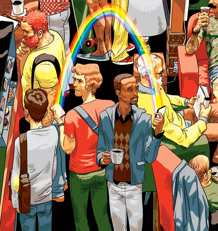
These first two images are of the amazing layout that Justin did with the illustrations. I think it’s one of the finest jobs someone has done laying out my artwork to date, and am happy that he’s given me the OK to post them here. You can click on either one of the spreads to see the illustrations enlarged.

I wanted to be a little more subtle but still have an emotional impact on the opening illustration. This can be a really tricky thing, since people are usually flipping through a magazine pretty quickly. I was pretty adamant about not wanting to show any obvious drug references, but was also concerned that the surfboard leash wrapped around the figure’s wrist would be too subtle. Fortunately, Justin agreed that this solution would work.

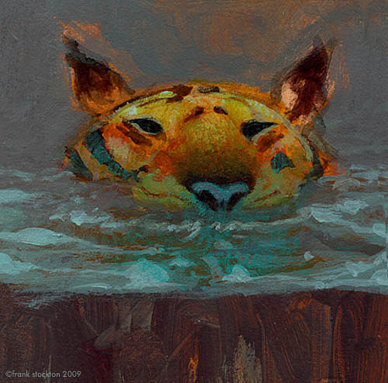
I re-drew this basic pose several times, but it wasn’t working. I could have just toughed it out, but I decided to totally scrap this pose and start over. It’s a tough thing to do sometimes, because you usually want to stay somewhat close to your initial sketch, and it’s easy to get lost in trying to make it work. You have to art direct yourself a lot of the time, though that’s sometimes very hard to do.

Finally, I came up with a pose for the underwater figure that I was happy with. The illustration before this point was starting to make me really anxious, but when I had the insight to switch it up, I knew I could do a good job on it, and could focus on the colors.

Lastly, here are some screen shots I took while trying to work out the color.
Thanks for reading!
frank

16 Comments
Add Yours →I think you definitely made the right move to change the pose. It gave more room to draw the awesome wave and it feels more balanced. Love the color choices too.
super fine excellent work, Frank. That glow in the sea-foam is incredibly dreamy, and very befitting.
Beautiful finish.
Very kind of you to post your processes, they're insightful.
great decisions every step of the way. cool to see that process.
Love it man. Great pose, great composition.
Beutiful! Just Beautiful!
Great image my friend!
Love this, design, colors and everything. This is the kind of art direction and draftsmanship that makes people get into illustration.
Wow. I think the result is powerful.
And you're right, I think it's very hard to start a new pose if you see It's not working. For me your work and most important, your way to think about it, it's an inspiration.
Thanks for your blog and your posts full of explanations and pictures of all the process.. Thanks a lot!
Thanks to Justin Long of Orange Coast Magazine for allowing you to post the images. I love the fact that an editor gives you the freedom to market your work. They should realize it's good marketing for them too, and makes me want to buy an issue of their magazine.
Anonymous – no kidding, my grandma bought a subscription and my mom purchased three copies!
f.
very interesting to see the whole process. thank you for posting!
Frank , this turned out great , you have reason to be pleased.
If ya have a moment , swing by the blog, you'll most likely dig the new post.
Cheers, Dom
Frank,
the compostion change midstream must have been difficult. Know the feeling. Keep up the good work! Excellent project for us to learn from.
CR
nuts! great handling of a complex subject!
Masterful sir!