
Hey guys,
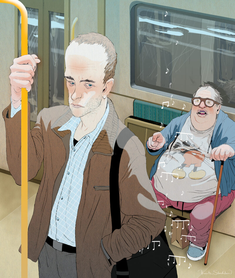
This image was done for Entertainment Weekly, and is in the current issue that hit stands last Friday. This week marks the 40th anniversary of A Clockwork Orange.
No sketch for this one, I just went straight in with ink and brush. The original is drawn with olive green shellac-based ink on a sheet of vintage paper.
Thanks for reading,
Frank
RSS feed

10 Comments
Add Yours →Very Cool! I love Clockwork Orange and you captured it all really well:)
Thanks, Kai!
f.
This is awesome! Don't usually get to see such a closeup of your figures. One of my new favorites of yours…
Dang Frank, no sketches? That was some gutsy move and it came out so good. Yeah.. I am admiring your skills right now.
Did you have to submit a thumbnail at least? It looks great, and its gutsy to just dive in–that's still something I can't quite bring myself to do–but I'm surprised they didn't ask for a sketch. Did you use a still from the film for ref? The uncolored drawing is so strong I may actually prefer it to the colored version.
Thanks, guys.
I've been working on a lot of personal stuff lately, and have been focused on returning to the idea that the natural "flaws" in my drawing are actually what give it strength.
I saw an interview of Philip Guston recently quoting Walter Benjamin as saying "Every masterpiece is also a ruin." And I kind of agree.
The past few years I've really been pushing towards tighter and tighter stuff, in a way that made me a better intellectual designer, but I think the drawings lost a little bit of the rawness that my earlier work had.
Jed — I submitted a different sketch earlier in the process, and they turned it down, but because I was out of town when they gave me the feedback, and it was a quick deadline, I just described what I wanted to do over the phone. The AD trusted me, so I just dove in. Also, thanks for the props on the drawing 🙂
best,
frank
The point of view really makes this drawing engaging.
I also really like your style, your work has a very unique feel which makes it memorable.
Cool!
this is so great! definitely feel you made a great decision going direct. congrats on another successful piece!
So cool! Love that movie