
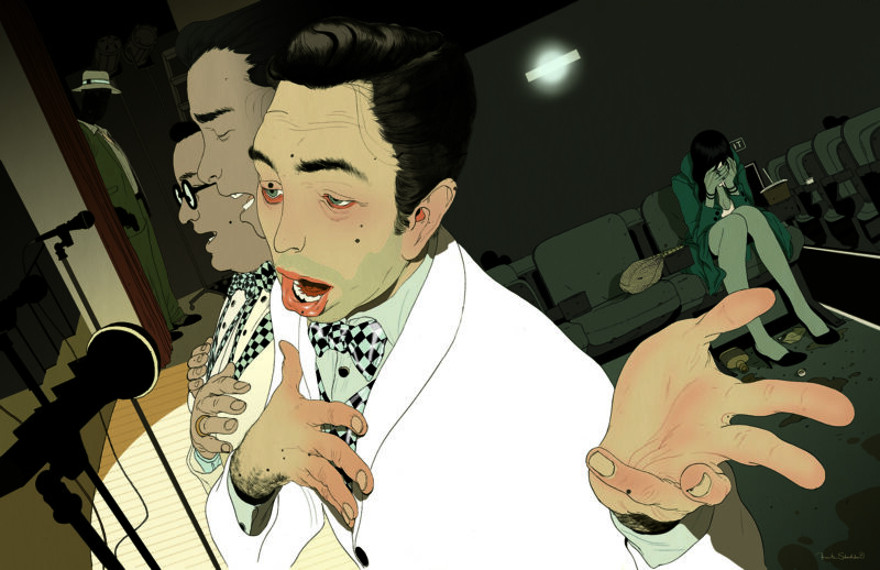
A few weeks ago I got a call from Debbie Kim of Los Angeles Magazine asking if I was interested in doing something for their book review section.
Being originally from Southern California, I thought it would be particularly cool to do something for them, if because maybe there’s a chance that one of my old friends still living in L.A. will be more likely to stumble upon it.
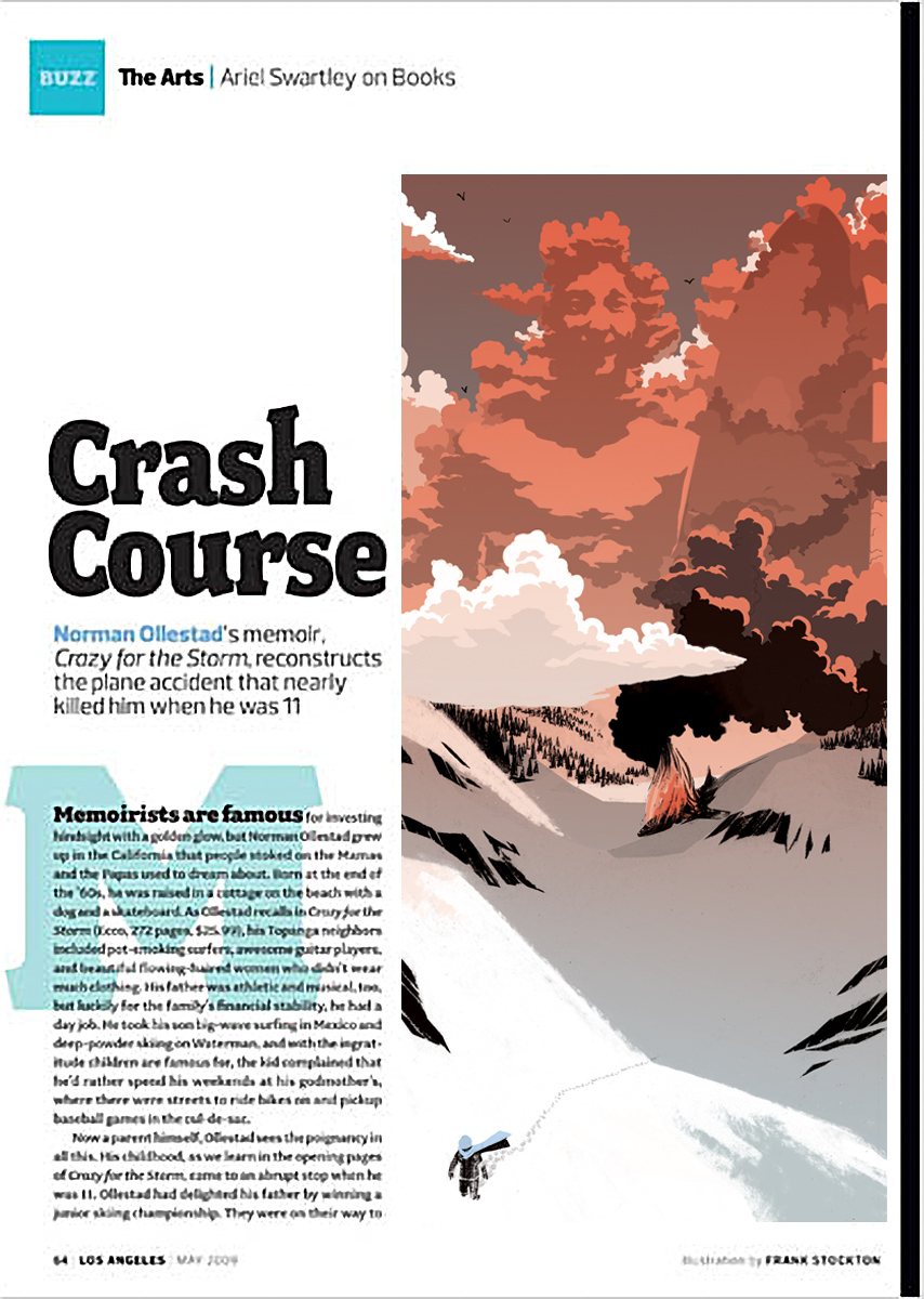
The book review I was illustrating was for a recently published memoir of Norman Ollestad, who as a 12 year-old child survived a plane crash in the mountains that killed his father, the pilot, and his father’s girlfriend. The book recounts his thoughts and reflections on life with his beach-bum father as he makes the treacherous journey through the icy wilderness back towards civilization. Heavy stuff to say the least.
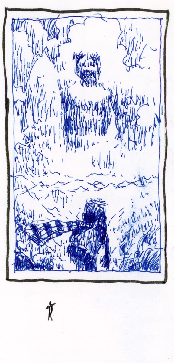
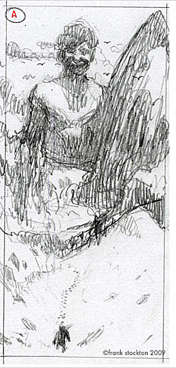
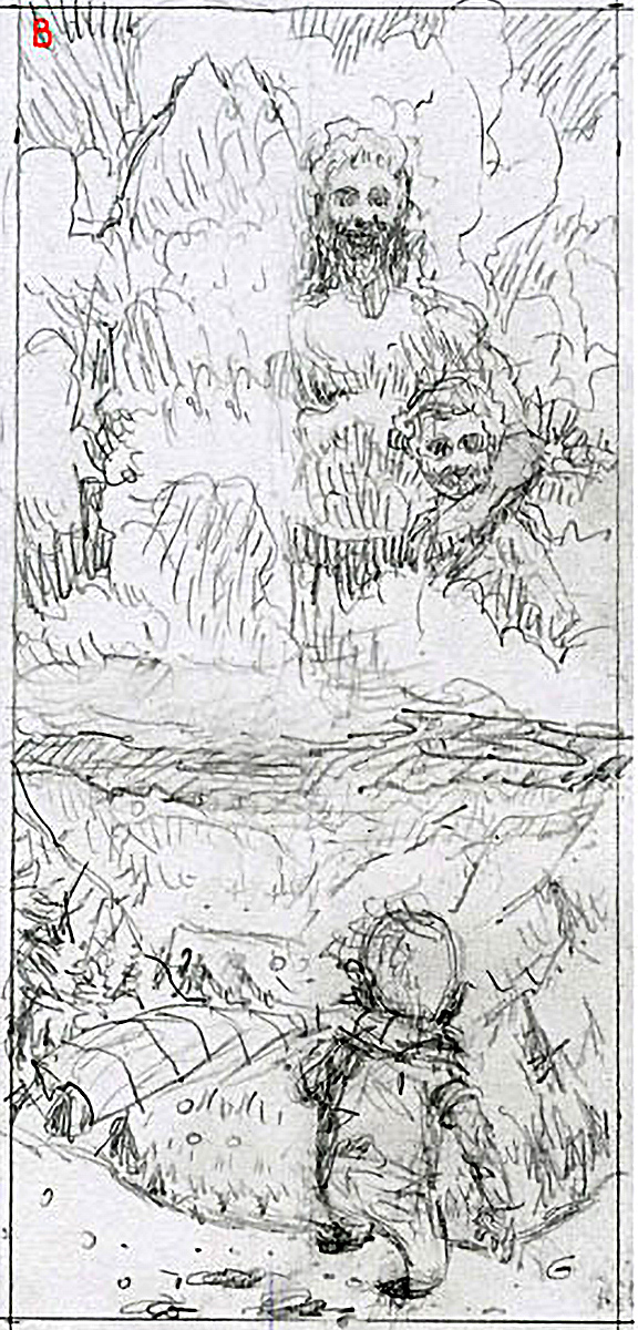
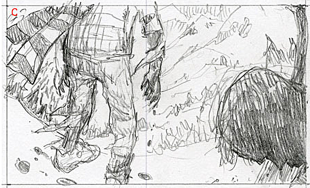
Being Los Angeles Magazine, I knew it couldn’t be very dark, but of course has to stick to the subject at hand. I did a few sketches based on the idea of the journey and the psychology of what the boy must have gone through. To me, the key to the concept seemed to be over-all the presence of his father looming over him as he made the journey. And to a lesser extent, the plane crash.
Debbie liked the first sketch best, and we talked about making Norman larger, but after talking it through she agreed with me that the thing that made the first concept work was the scale of the father to the son. Truth be told, I felt that sketch B would have been more fun to draw, but I knew that A was best and that it would be more challenging.
Over the phone, Debbie shared some ideas of where to take the final, such as making the boy look older.
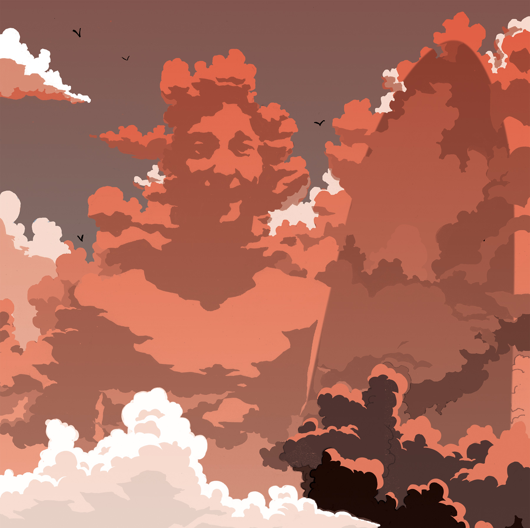
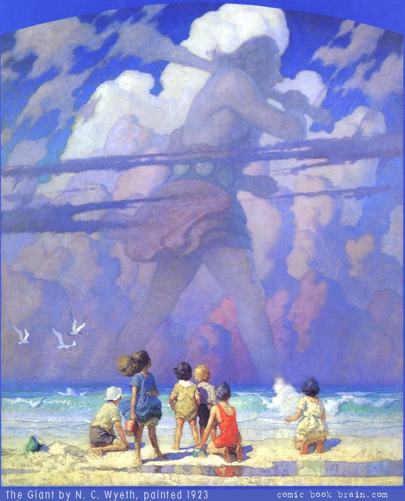
Lately I’ve been working with adding texture to my pieces, as well as experimenting with adding graphic light sources. I wanted to combine both experiments in this piece by making the father’s image be the shadow side of the clouds, but in the end I had to go for a simpler (and much better) graphic solution. By the way, I kept thinking of an illustration by N.C. Wyeth while I was doing this, which is probably the reason I tried so hard to make the softer charcoal version work. Maybe next time though…
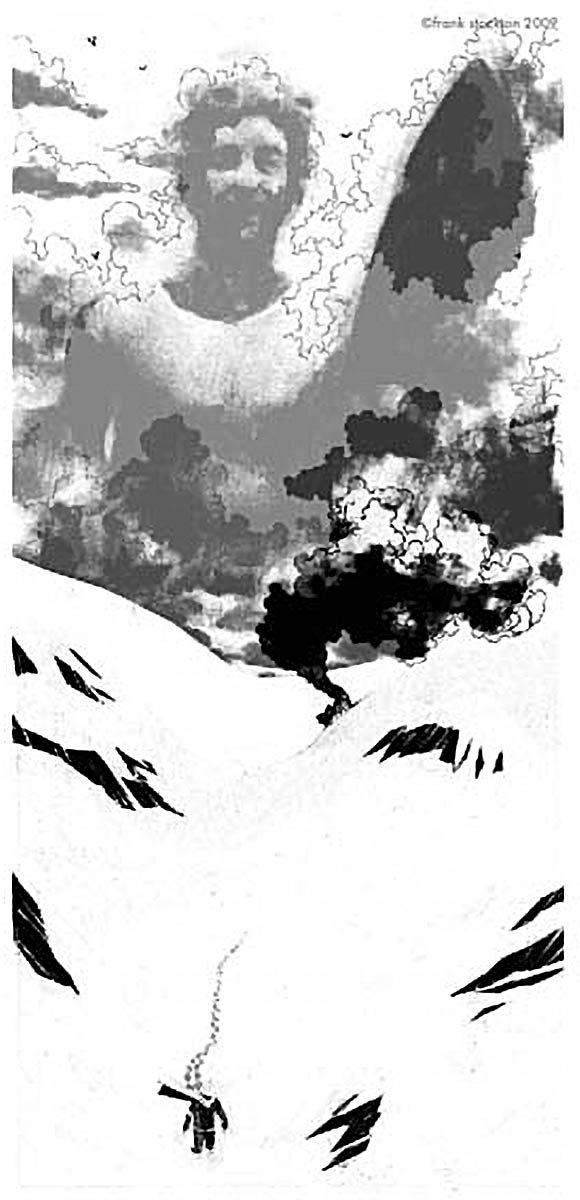
Because I couldn’t seem to get him to look like he was made of fluffy white clouds instead of being a montaged image, I decided to try a different approach.
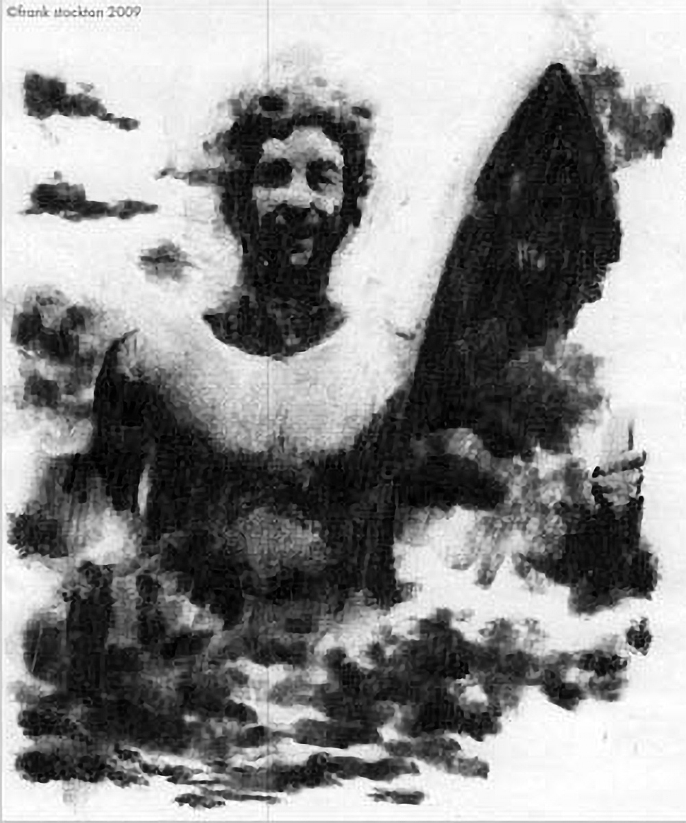
[center] At one point I tried drawing the highlights on top of the clouds to see if that would do the trick, but I was still unsatisfied, and eventually decided that there wasn’t enough time to continue in that direction.
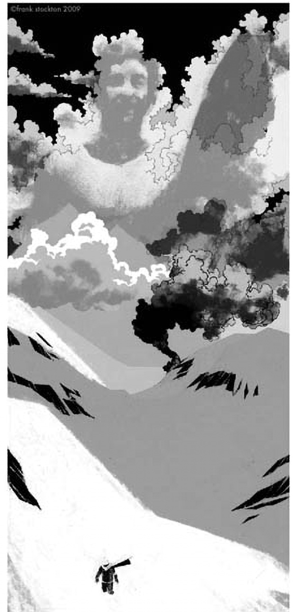
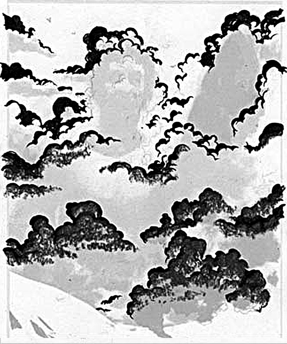
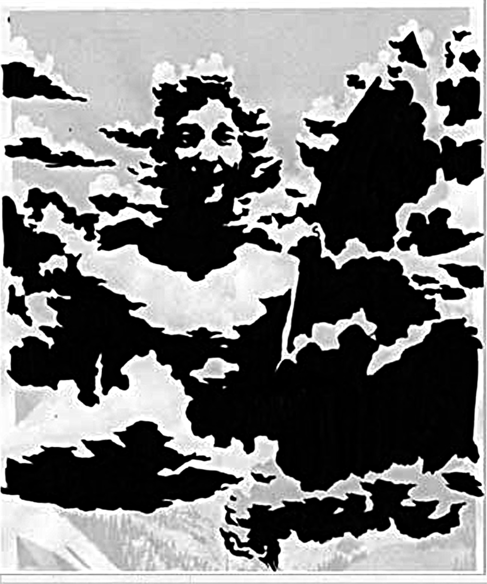
[right] I re-drew the shadow side of the clouds in solid black ink, and the result is something I am actually quite pleased with.
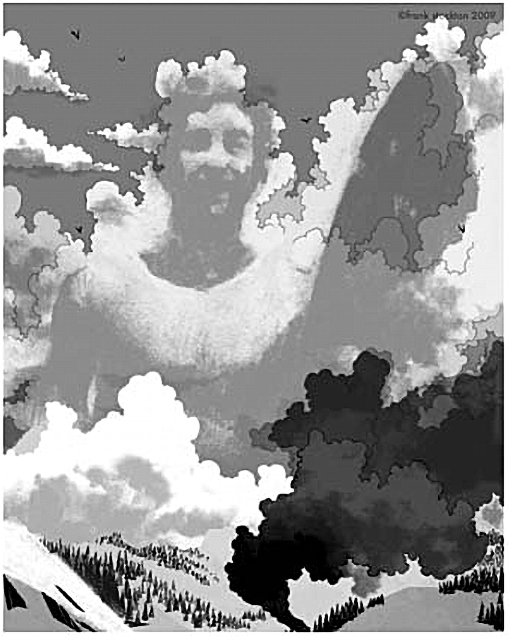
When I was finally satisfied and out of time to keep toying with it, I sent the illustration away and shortly thereafter got some feedback from Debbie. She asked me to move some elements around and make the plane crash more apparent, which she was totally right about.

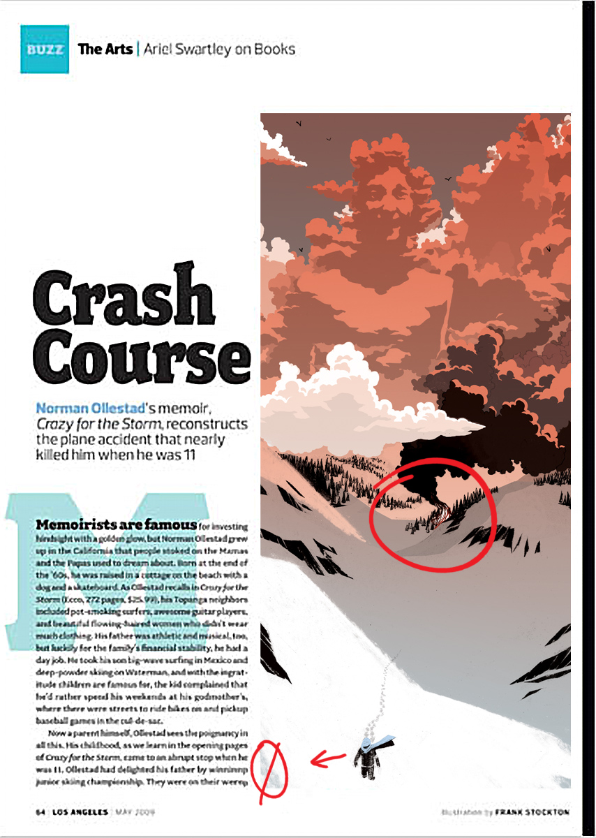
Sending me the illustration in the layout was helpful to me because I could see what she meant about moving certain elements around rather than her vaguely describing what she wanted me to do. I always get excited when I’m asked to collaborate on the design end; it shows that the designer really cares what the final product will look like, and in turn makes me want to do a better job.
Here is the final illustration in the layout. The issue should be out soon if not already. You can click on the image to enlarge it.
Thanks for reading,
Frank
14 Comments
Add Yours →Great illustration, Frank. 🙂 I love seeing the progress, it helps me get away from my “oh but I know what I want to draw, I dont need sketches”-habit.
Clients aren’t usually willing to go to final without sketches. That’s only ever happened once and I was doing the job for free.
f.
These posts are where it’s at Frank. I love to see process. Heck, you could have done one of these on your layering/texturing techniques and I would have been just as engrossed!
You made it! Thanks for sharing!
Wow looks awesome, I love the colors of the clouds! The sketches-to-final progression is really great to watch. 🙂
The figure in the clouds is a really effective and graphic image. I think the fire could have been a little more fire-like, but the lighting, the limited palette, a really successful piece.
Thanks for putting up all the sketches with it. I’m really partial to the lighting on the snow.
excellent process piece…I really appreciate all the effort you put into your work.
Strong like bull! Fantastic post, fantastic piece. Thanks for sharing, Frank.
Seems like the work paid off. Nice
MM delicious, thank you matey, as every one here has already said the steps really help, and the final looks really good.
I like the dephth of the image and the nicly put together/planned out layout =)
I’m going to have to capture a designer and torture him for all the layout design secrets =). Or just ask nicly lol whichever
nice post frank
Love seeing the process. Like the end result with the clouds…
As always , SOLID.