
Content Advisory: The Playboy feature below contains artistic nudity in an editorial context.
Note: This archive post has been reordered to lead with the interview, followed by the original feature and wallpaper.
Finally a “normal” week to post. Well, actually a bit more special than normal because I have a few things to report — new illustrations, an interview I did for a Taiwanese magazine, and a desktop wallpaper of the Dark Knight piece I posted a couple of weeks ago–it sure beats waiting in the airport for hours on end.
DPI Magazine Interview
A few weeks ago, DPI Magazine from Taiwan interviewed me for their current issue. I’ve only been formally interviewed about my art a small handful of times, and I’m always surprised by the questions people ask.
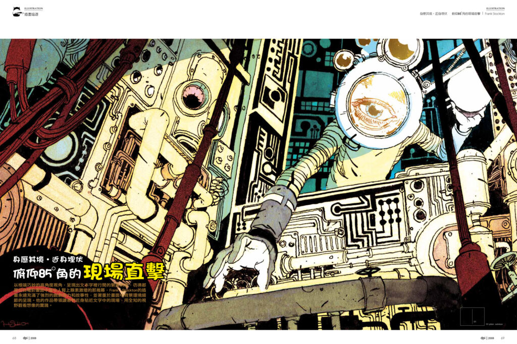
With these guys, it was also interesting to see what pieces they took a liking to; for example the spread I have posted here is of an image that I was never particularly struck by, but I think actually looks pretty cool the way they’ve layed it out. The spreads here are used by their permission and are what the feature in the magazine will look like.
Here is the the interview:
1. The angle of vision in your drawing is usually dramatic. It makes your works unique and full of tension; why do you prefer to set the view from looking down or looking up? Any purpose behind this way?
People have asked me this before and I think it’s interesting because I never consciously decide ahead of time to do that. I think the reason I tend to go for the extreme angles is just that it gives me more options compositionally; often if I’m drawing a straight-on view, I can’t get much of an environment into the image, or I’ll have to decide what to do with too much of an environment.
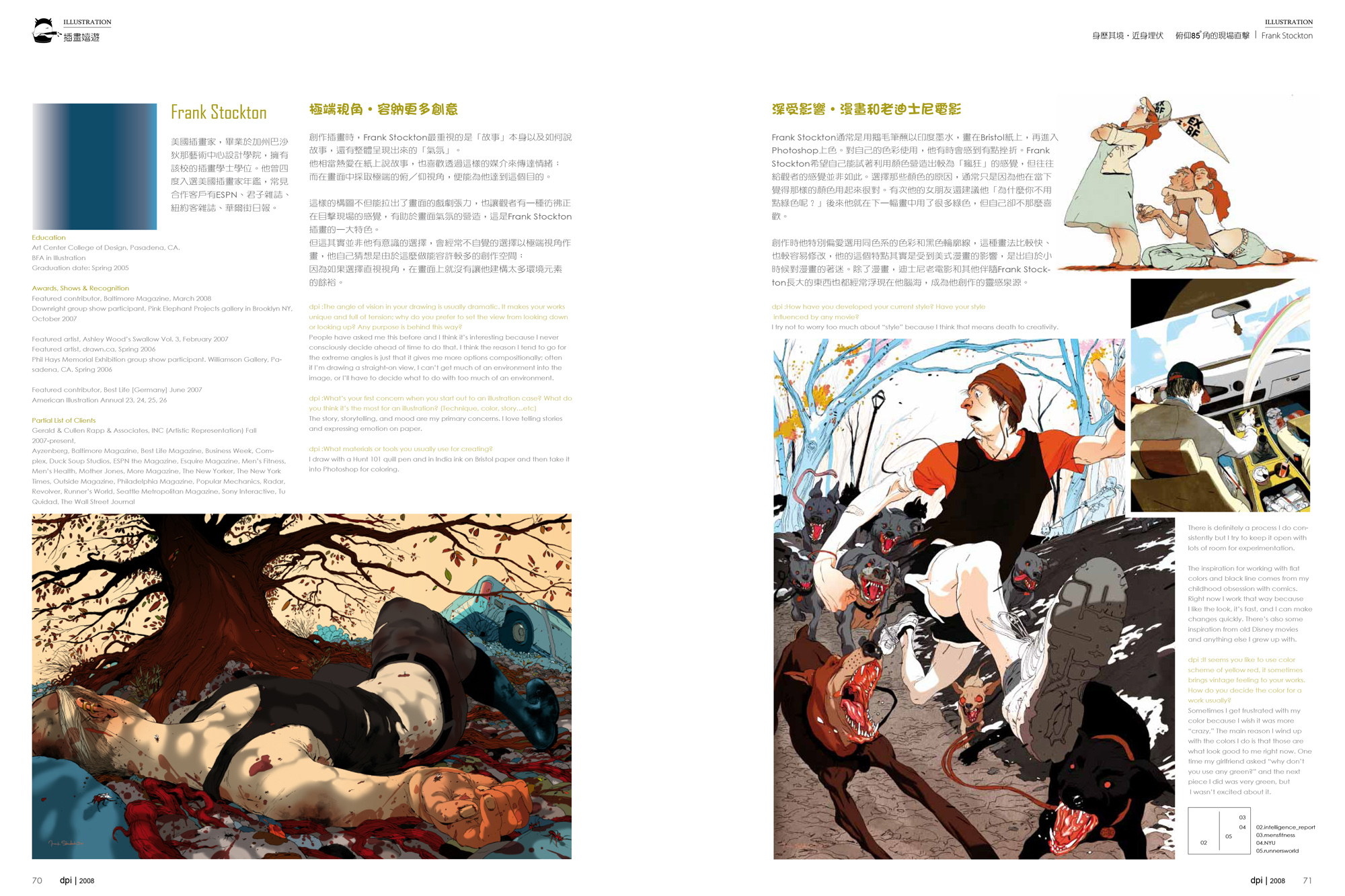
2. How have you developed your current style? Have your style influenced by any movie?
I try not to worry too much about “style” because I think that means death to creativity. There is definitely a process I do consistently but I try to keep it open with lots of room for experimentation.
The inspiration for working with flat colors and black line comes from my childhood obsession with comics. Right now I work that way because I like the look, it’s fast, and I can make changes quickly. There’s also some inspiration from old Disney movies and anything else I grew up with.
3. What materials or tools you usually use for creating?
I draw with a Hunt 101 quill pen and in India ink on Bristol paper and then take it into Photoshop for coloring.
4. What’s your first concern when you start out to an illustration case? What do you think it’s the most for an illustration? (Technique, color, story…etc)
The story, storytelling, and mood are my primary concerns. I love telling stories and expressing emotion on paper.
5. It seems you like to use color scheme of yellow red, it sometimes brings vintage feeling to your works. How do you decide the color for a work usually?
Sometimes I get frustrated with my color because I wish it was more “crazy,” The main reason I wind up with the colors I do is that those are what look good to me right now. One time my girlfriend asked “why don’t you use any green?” and the next piece I did was very green, but I wasn’t excited about it.
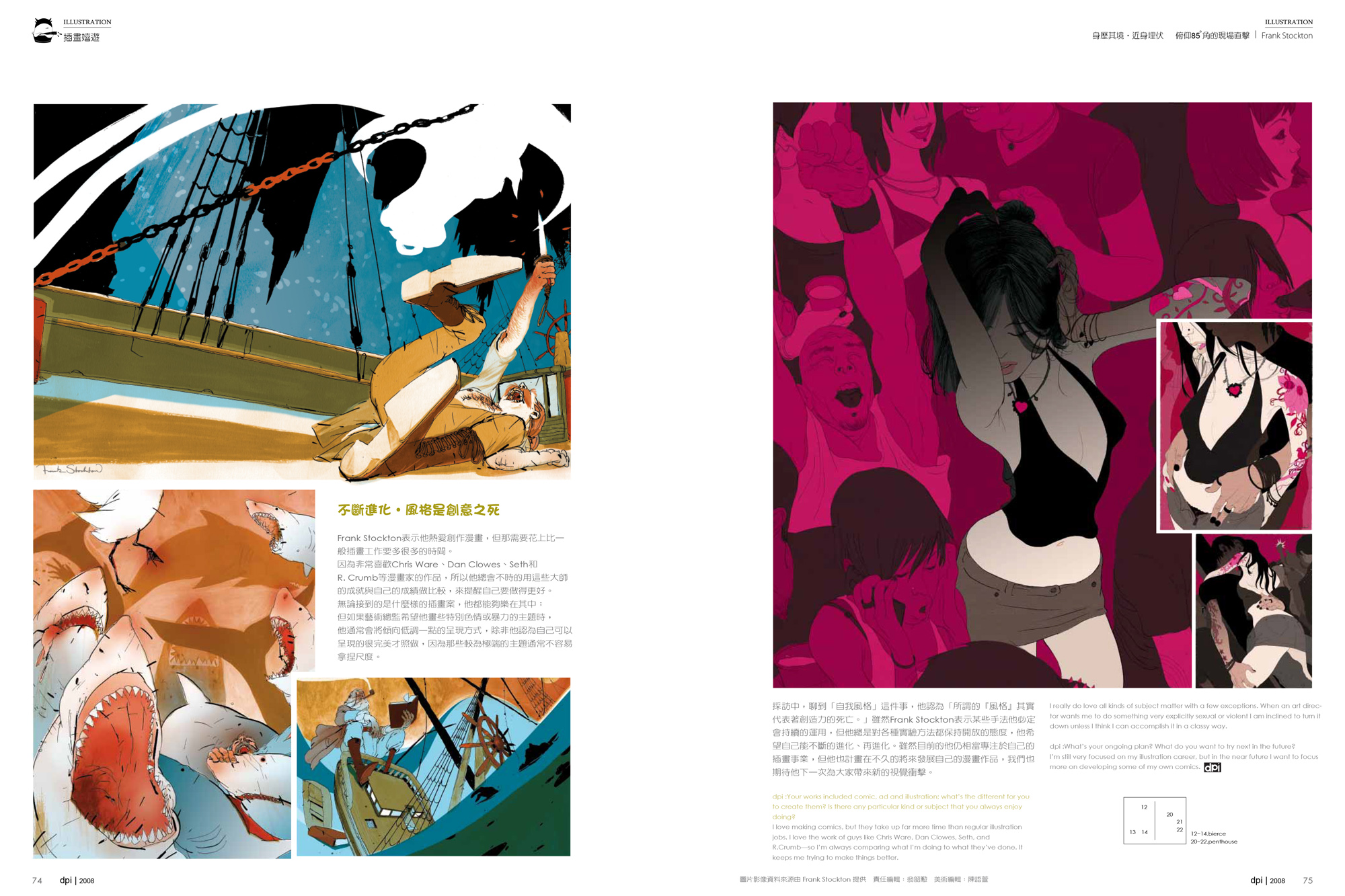
6. Your works included comic, ad and illustration; what’s the different for you to create them? Is there any particular kind or subject that you always enjoy doing?
I love making comics, but they take up far more time than regular illustration jobs. I love the work of guys like Chris Ware, Dan Clowes, Seth, and R. Crumb—so I’m always comparing what I’m doing to what they’ve done. It keeps me trying to make things better.
I really do love all kinds of subject matter with a few exceptions. When an art director wants me to do something very explicitly sexual or violent I am inclined to turn it down unless I think I can accomplish it in a classy way.
7. Please talk about the story and your creating concept of “Science” (half page for Plan Advisor, December 2007
I don’t remember what this assignment was about. Plan Advisor is an interesting magazine where the subject matter is so boring that almost anything goes, creatively. I remember that at the time I did the piece I was looking a lot at the work of the late, great Jack Kirby and was thinking of creating something with a retro sci-fi feel.
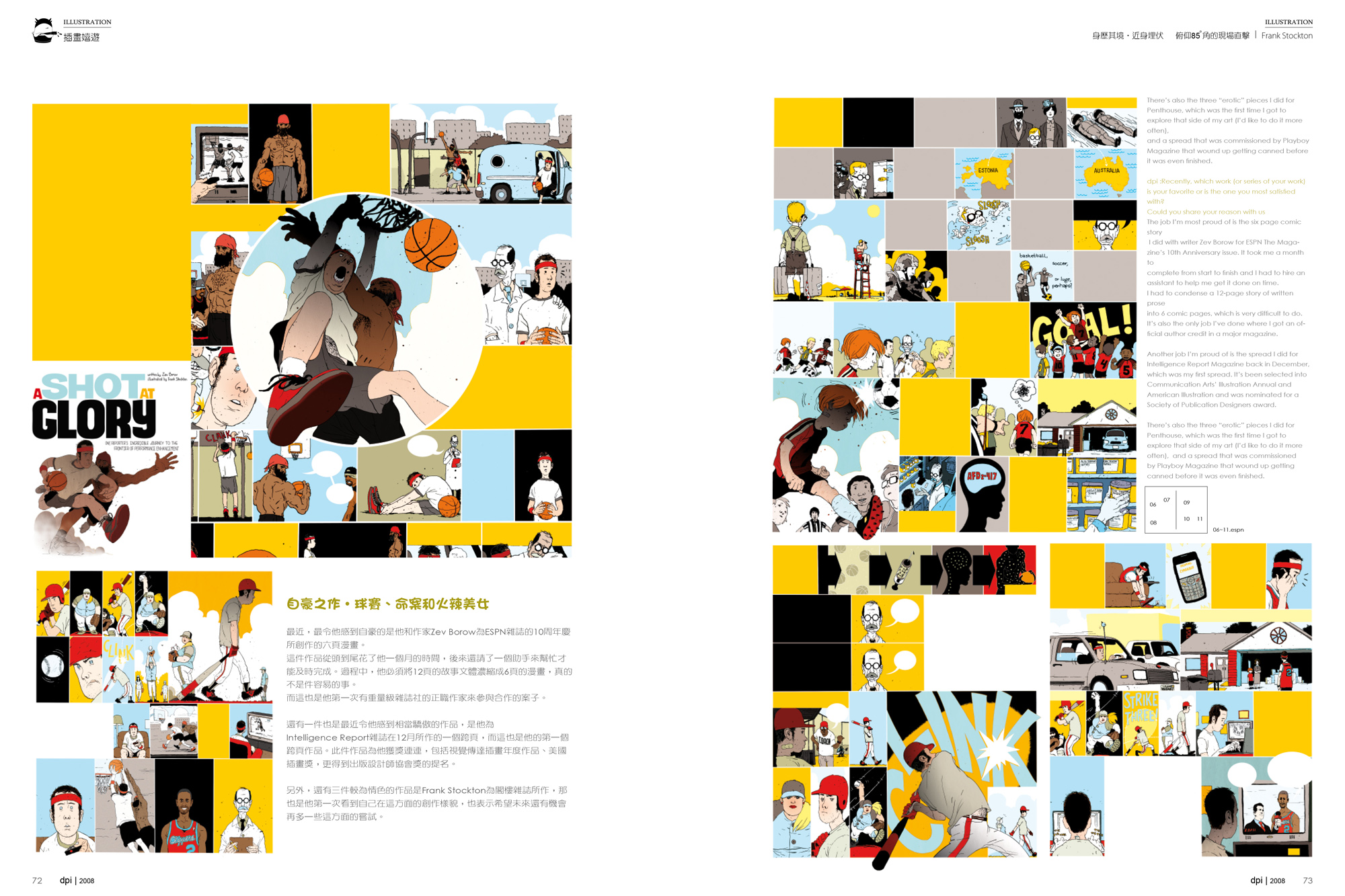
8. Recently, which work (or series of your work) is your favorite or is the one you most satisfied with? Could you share your reason with us
The job I’m most proud of is the six page comic story I did with writer Zev Borow for ESPN The Magazine’s 10th Anniversary issue. It took me a month to complete from start to finish and I had to hire an assistant to help me get it done on time. I had to condense a 12-page story of written prose into 6 comic pages, which is very difficult to do. It’s also the only job I’ve done where I got an official author credit in a major magazine.
Another job I’m proud of is the spread I did for Intelligence Report Magazine back in December, which was my first spread. It’s been selected into Communication Arts’ Illustration Annual and American Illustration and was nominated for a Society of Publication Designers award.
There’s also the three “erotic” pieces I did for Penthouse, which was the first time I got to explore that side of my art (I’d like to do it more often), and a spread that was commissioned by Playboy Magazine that wound up getting canned before it was even finished.
9. What’s your ongoing plan? What do you want to try next in the future?
I’m still very focused on my illustration career, but in the near future I want to focus more on developing some of my own comics.
Playboy Feature
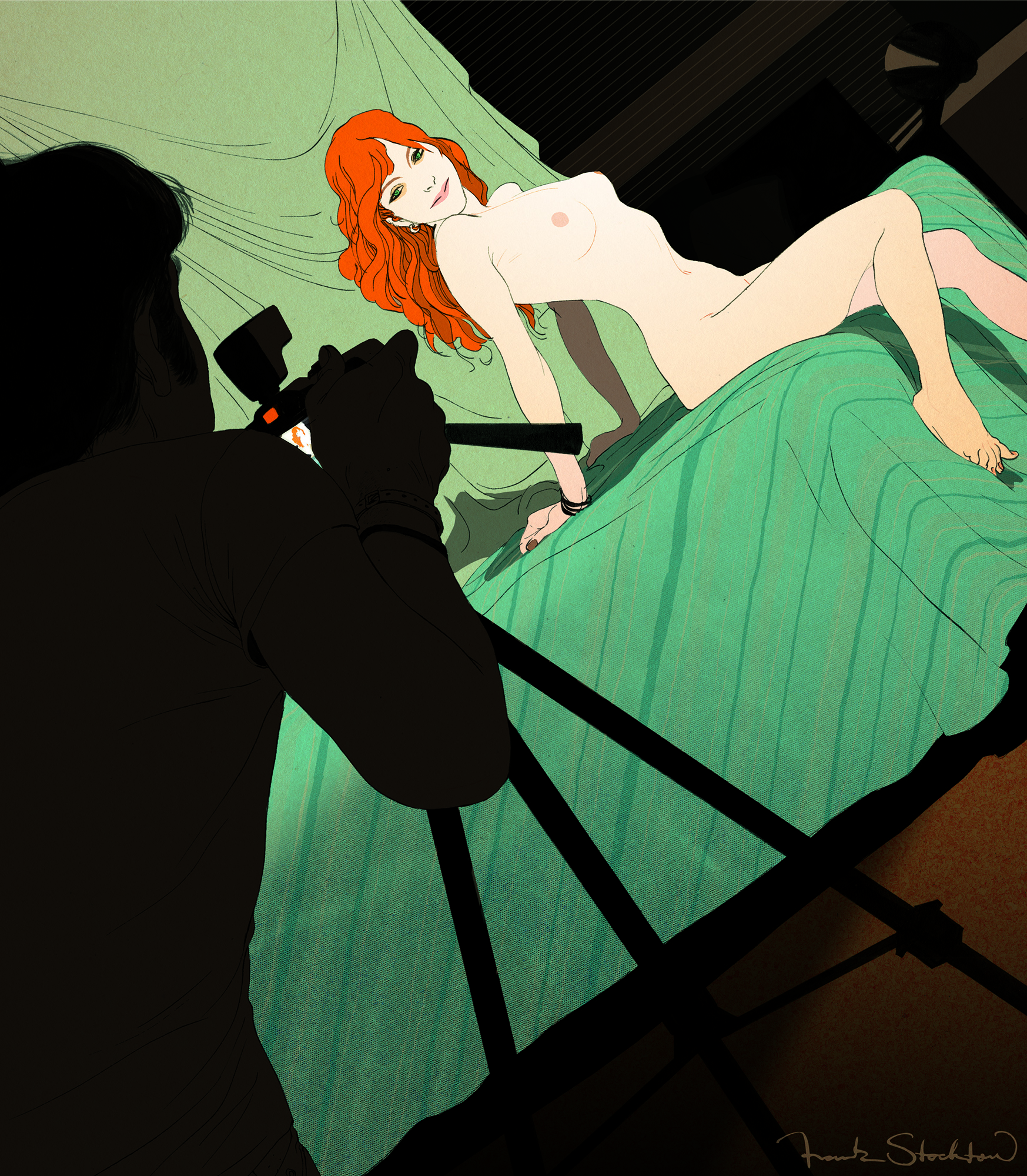
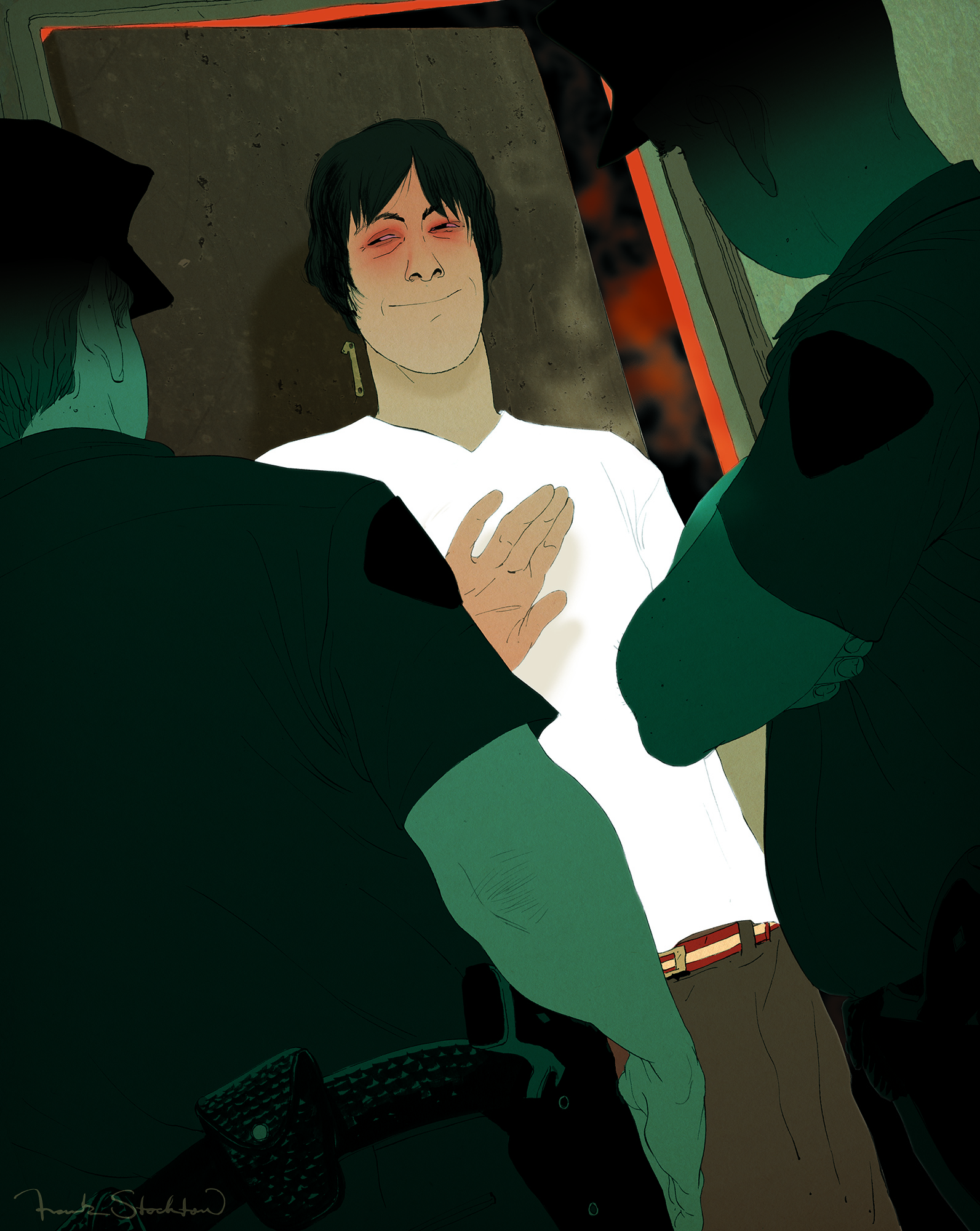
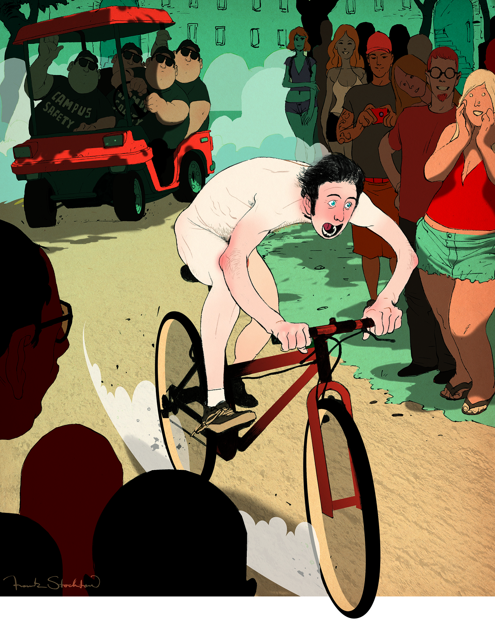
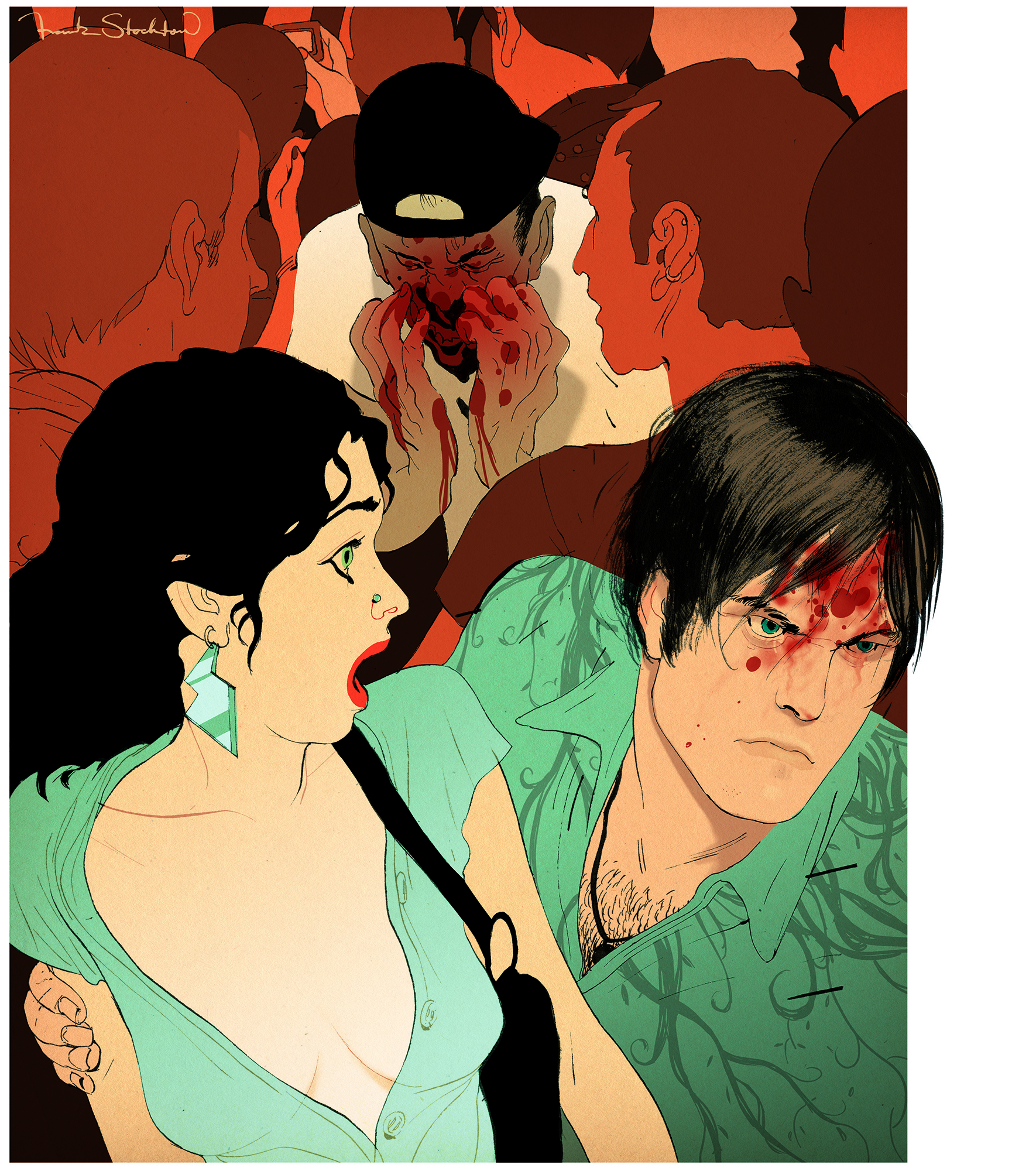
These pieces were part of a series of 5 that I did for Playboy Magazine a little while. It was an interesting how-to article for guys about handling some tough obstacles that come up sometimes in life.
This first one is about getting your special lady to pose nude for the camera, and the second one is about how to talk to the cops when they’re knocking on the door of your party.
For the sketches I actually went a little looser than usual. I’ve been playing with different ways of doing sketches for the last few weeks–different materials, approaches, etc.– to try and see if I come up with any really different ideas. So far Things have been pretty much the same, but it makes the job more interesting.
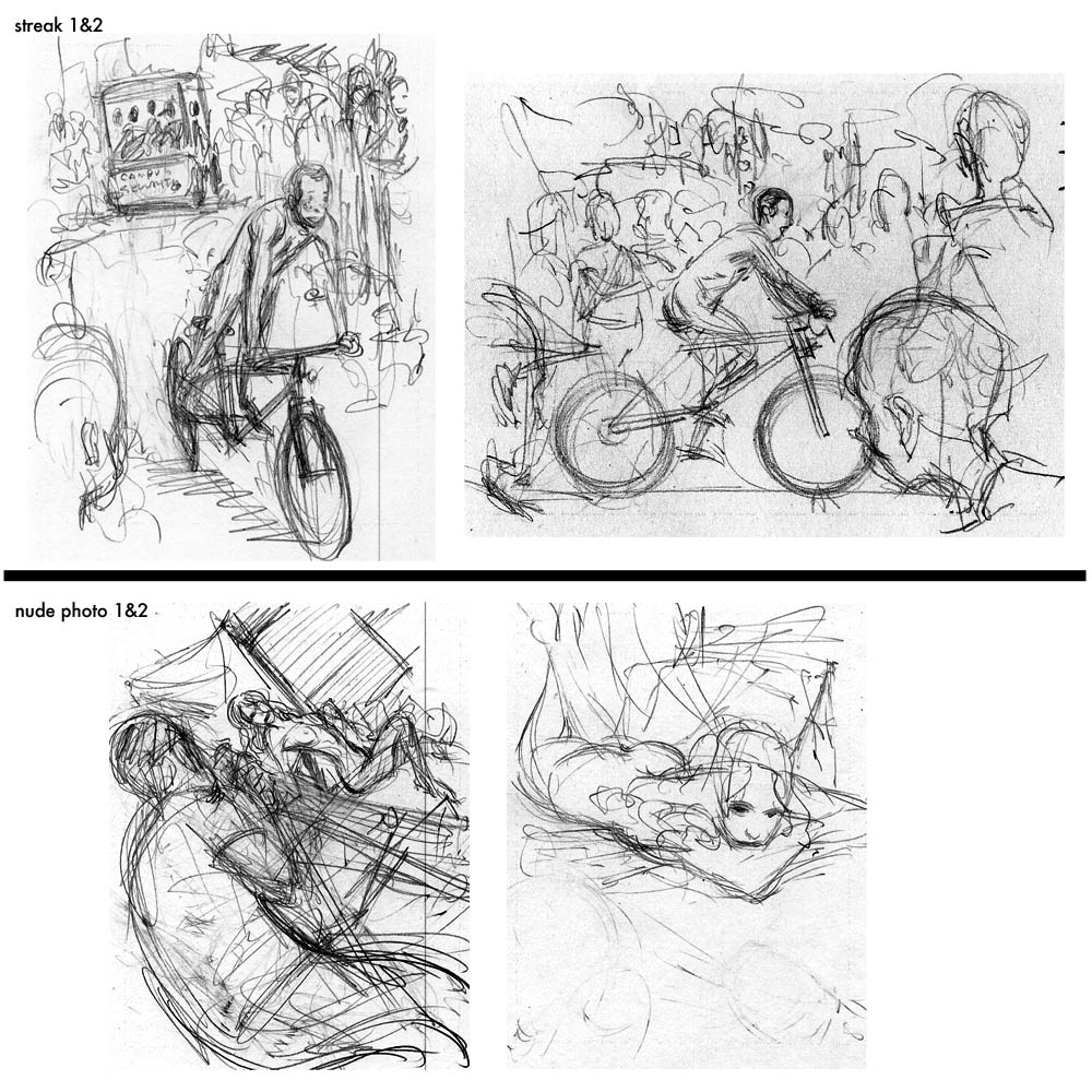
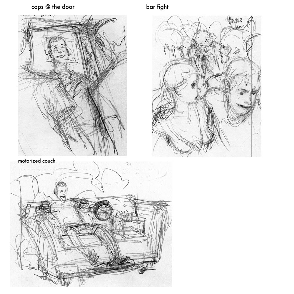
In the inked versions you can see how slick I made the line. I’ve been progressing this way for a while now but feel the need to bust out some looser stuff soon. By the way, the lightened lines are something I started doing several months ago. I’m still not sure whether I like it that much or not. Honestly I think I prefer to leave the lines black but I don’t always like how that looks.
The Dark Knight – Desktop Wallpaper
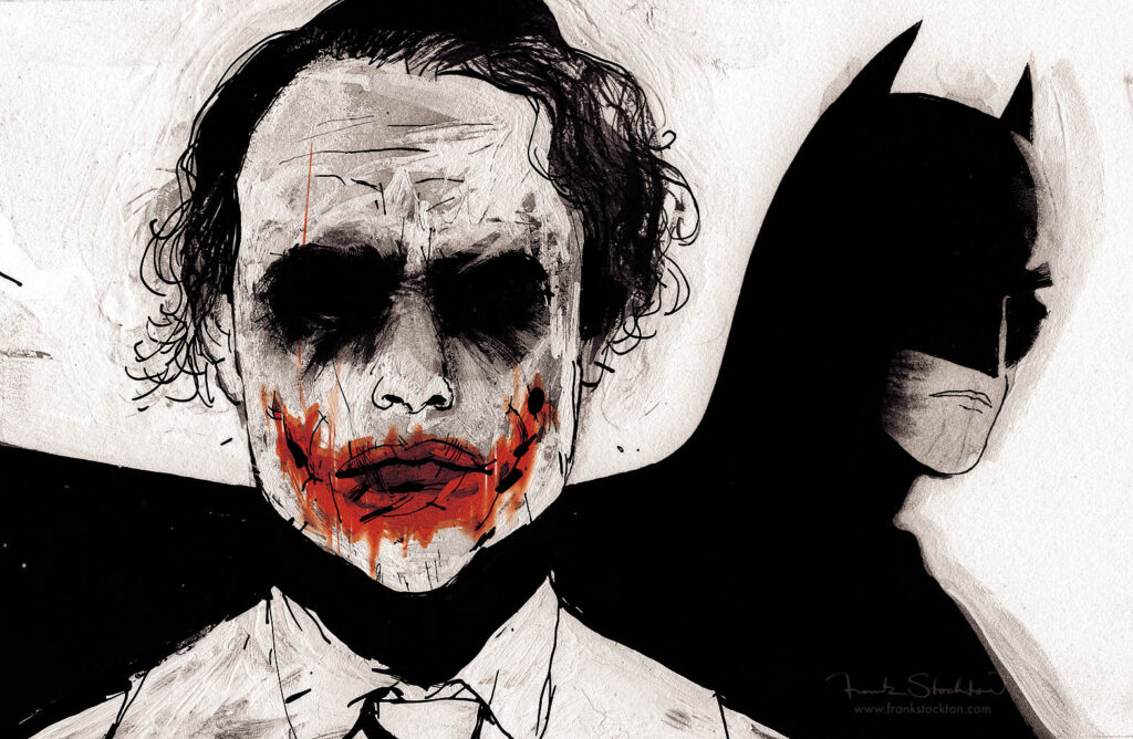
Lastly, I’ve decided to share a wallpaper version of the Dark Knight image I did for the New Yorker a couple of weeks ago. Feel free to take it… if you still have Batman Fever.
thanks for reading,
Frank

12 Comments
Add Yours →Hi, Frank! I love the blog and being able to see your processes, but i can’t seem to find a back button to view older posts! is that something that firefox is messing up for me? or something you’ve disabled? i have a suspicion i’m just really blind and its sitting right in front of me somewhere, but thought i should ask..
Hey, thanks for checking out the blog.
To answer your question, the only way I know how to do that is to click on the RSS logo, which will give you access to a lot more posts. In the near future I may have a way to go allll the way back to day 1, but I’m still working on that.
f.
ah! i can live with that! thanks for the help, and again some very beautiful stuff here. love the line control and ink work 🙂
Hey Frank, awesome work with the playboy stuff. I’m torn whether or not I prefer your heavier linework, or the new more sleek lines your pumping out. Either way its great! I love it. Also, thanks for the batman background, my brother and I got it on our desktops so thanks a lot! I didn’t catch the crazy texture in the original image you posted of that a few weeks back, the grungy sorta way you did the joker’s face is sick. Oh, and I picked up a quill pen and some tips’ you recommended, I’m gunna try playing with that soon I’ll let you know how it turns out!
-Steve
Thanks, Steve. I haven’t decided on on a single way to make lines, they tend to get dictated by the subject, my mood, how the last drawing went, etc.
I’m glad you liked the background and I can’t wait to hear about your progress with the pens.
f.
Love the Batman image Frank.
-Kenichi
That second Playboy image really pops Frank! I have to say I’m partial to the colorized lines. Have you tried doing it traditionally with different colored ink?
-fv
Woah Kenichi, thanks for checkin out the blog!
Francis,Thanks @ the Playboy image.
As for the colored lines… I go back and forth between liking them and despising them. As for coloring the lines traditionally, I’ve never found a colored ink that flows right. The stuff I’ve used tends to clog up the nib too quick, be transparent so that there are shifts in value or be water based and get polluted by other inks around it… just too much of a headache to handle. The only way I’ve been able to get the kind of lines I like that are colored is with Gouache and a brush, but I’m not that comfortable drawing with a brush.
Ok, end rant. If you know of any awesome colored inks, let me know and I’ll give them a shot.
f.
What amazing job you have here.. I am amazed.. thanks for sharing!..
Hello Frank,
What can I say?
I guess you know that your work is a sum of condensed, dramatic journalistic perspectives, zoom-in observation and finely transformed thoughts of the topics it illustrates. The digital polish on the drawings is directing the spot closer to this, even.
I will pick up some magazines with your pictures when I’m in the U.S.!
best,
Simon
Frank! I love how you said, “When an art director wants me to do something very explicitly sexual or violent I am inclined to turn it down unless I think I can accomplish it in a classy way.”
You’re wonderful.
Love the Joker. Its fantastic~
-Sheenna
Hello Frank
I have no approval of the covering range of these coloured inks by this label yet, (as I only have worked with their real good black one) but I’m tempted to try the calligraphy inks. They have a wide selection of different and special high quality inks:
http://www.rohrer-klingner.de/
I hope this was a bit helpful…
best,
Simon
BIG PS:
What can I say: You possibly know that your drawings and illustrations are, like you know, super flowing and beautiful?
Ah- I’m not good at this…