
It’s Springtime!
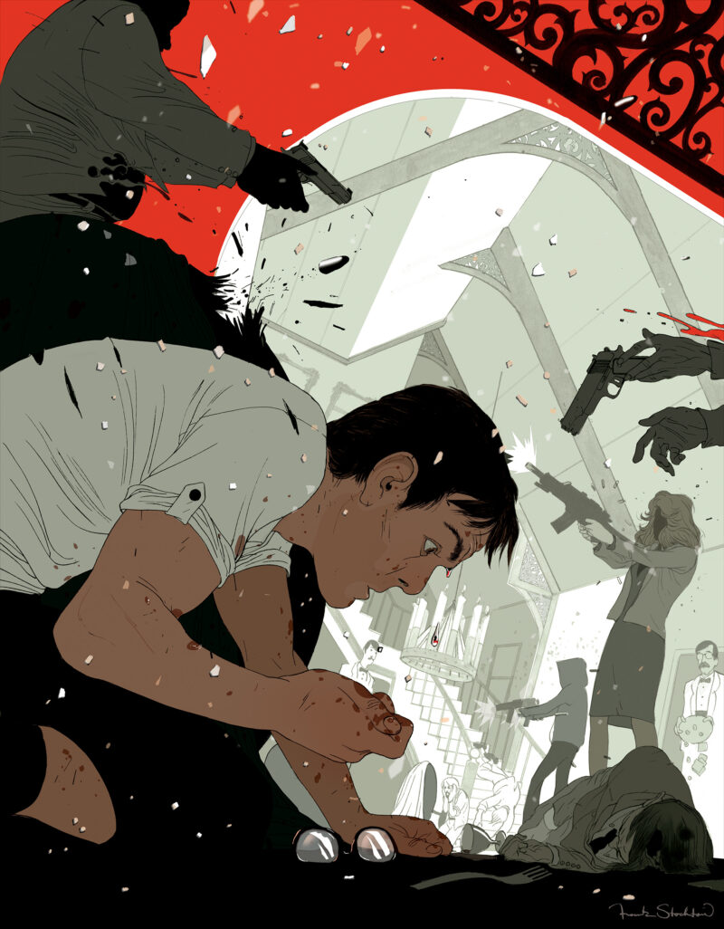
Several weeks ago I got the call from Rob Wilson at Playboy to illustrate a spread for a short story that would be serialized in four sequential issues of the magazine. Playboy magazine was one of the magazines I’ve always wanted to work for since I was in school, and I had a subscription for a while because every month they would deliver to me full color illustrations by such illustrators as James Jean, Kent Williams, Phil Hale, and many others.
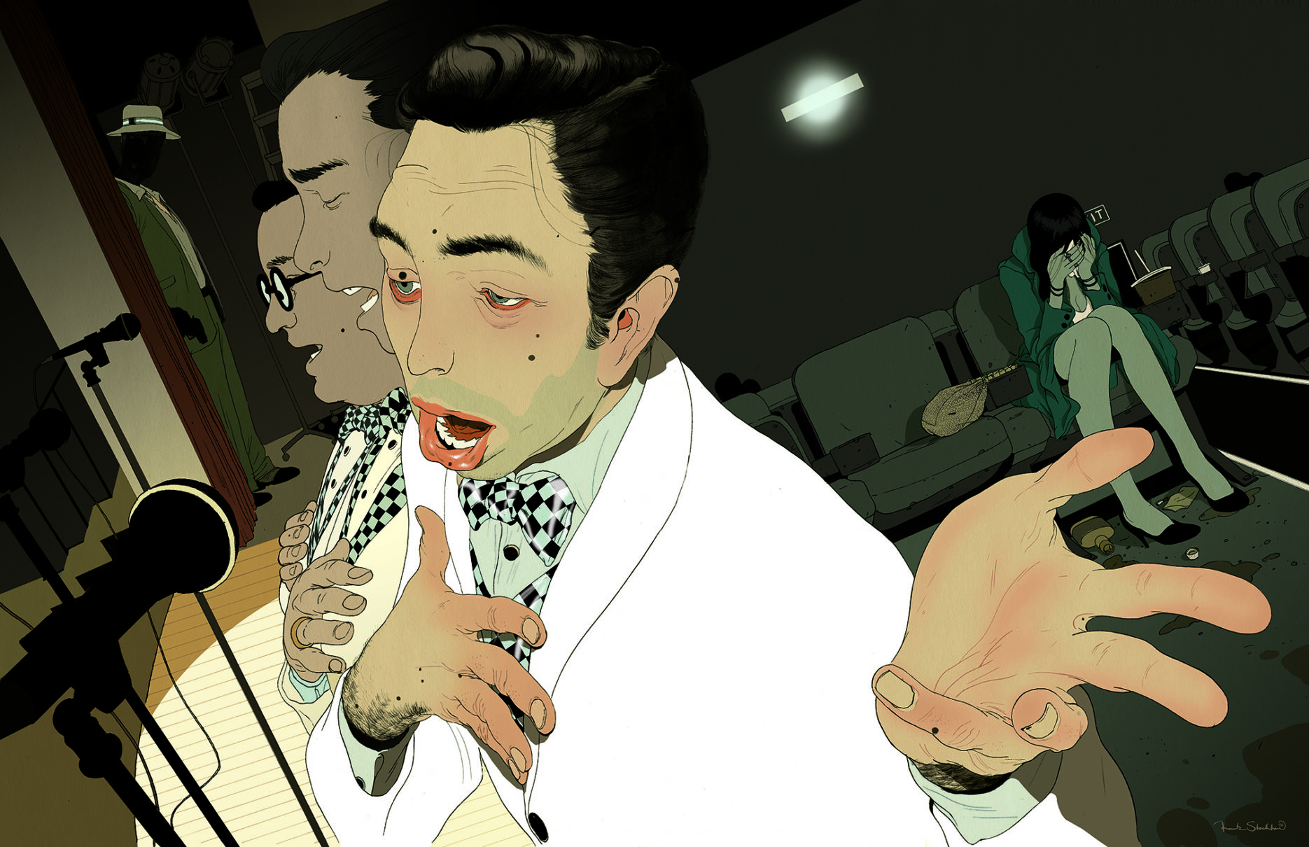
The story was a Pulp Fiction-like Noir piece about a bunch of incompetent unscrupulous characters.
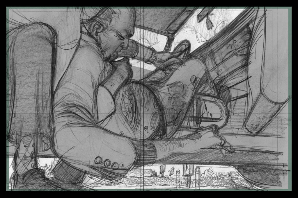
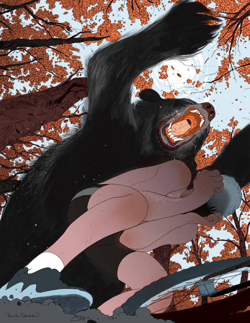
I did just one initial sketch for this because I wanted to do something as awesome as possible. I was pretty psyched about getting to put tons of cool details and ambiguous drama into it.
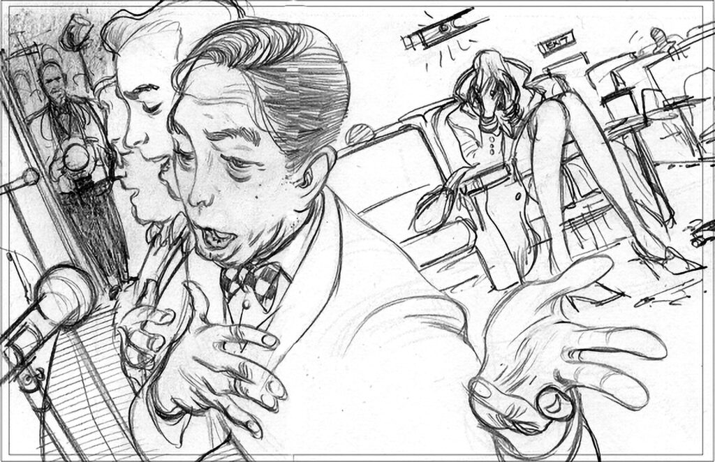
The editors thought that this gave away too much of the story, and the story had changed a bit since my first version was sketched up, so I went back to the drawing board to have another go at it. I tried to focus on the quirky lead character for this second one–he’s the type of guy no one expects to go crazy–but he’s not the type to think things through.
They said to go ahead with the sketch and I started taking it to final…
Unfortunately, the day before the piece was done, Hef decided he wasn’t happy with where the story was going and decided to kill the whole project.
Because I was so into the piece, I spent my spare time over the last week finishing it up to post on the blog. Also, it’s going to be featured as a large desktop wallpaper on a “secret website” in the near future. I’ll keep you posted when that happens.
Thanks for reading,
Frank

12 Comments
Add Yours →Great noirish feel to this one. I’m glad you post all the things that get axed, because otherwise we wouldn’t get a chance to see them.
Please keep posting preliminary sketches too!
I really like the direction you took with this piece. The story telling in the final has a lot of depth to it. Your first, second and third reads all make sense and follow a wonderful rhythm throughout. Thanks for posting this Frank, even though the job was killed.
This is a very strong image, and I like all the character you worked into the face and hands, and the background details. Good stuff!
Hey Frank,
I already told you last night how much I LOVE this drawing, but now I’ve immortalized my feelings on the INTERNET! Awesome. . .
Hef’ll screw ya every time
-JT
Wow, Really great drawing on this Frank.. love the line work.
WOW sir I have to say you killed it on this last piece. Plus I love the composition on the other sketch! That comp begs to be finished!!!!!
take care
-Dustin
You probably know you’re amazing, but I thought I would tell you anyway. The foreshortening of the hand, the depth of composition … it’s a wetdream!!!!
flippin’ amazing, honestly the piece is gorgeous. Fingers are crossed for them passing you another project!
hey Frank,
great stuff I really love this one. It moves and just the over all composition is great. I am really curious how you’ve obtained that amazing lighting affect where the projector is in the wall. Is it just a color gradient from white to transparency?
-Steve
I’m spellbound by the draftsmanship on display and the composition. This is really one for the shows, Frank – it’s a shoe-in. Maybe even a medal contender?
-Kyle
Thanks for the positive feedback everyone. I’m pretty happy with this one. I’ll def. be entering it in some competitions over the next year–unfortunately it was too late to submit to CA or AI 27, but maybe the next round.
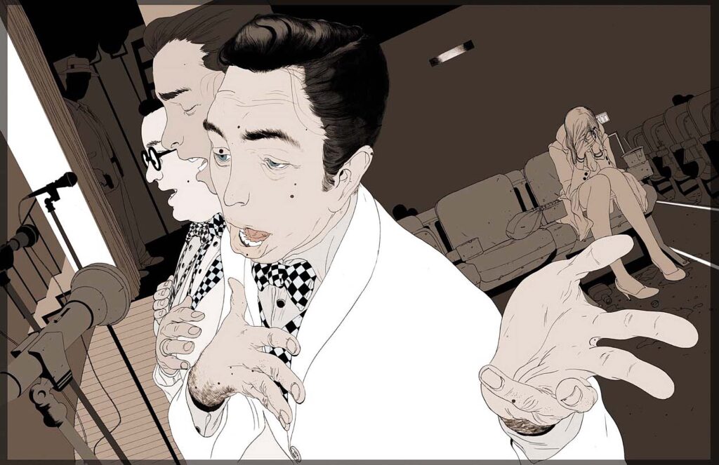
As for the projector light effect, Steve, I just used a photoshop brush set to airbrush and adjusted the opacity. Pretty simple.
f.