
Yo!
Here’s a few illustrations from this year that weren’t interesting enough on their own to make the blog. Since I started posting weekly, it’s been harder to find great pieces to show. I think that as a group these make a pretty cool post.


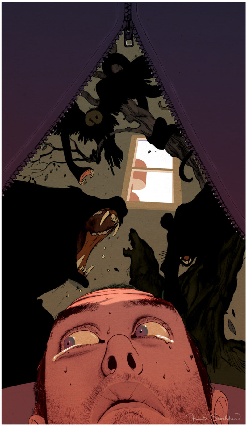
From top to bottom, left-to-right: 1/4 page for Field & Stream, full page for Runners World Germany, 1/2 page for Field & Stream, spots for Men’s Health, commissioned original drawing, 1/4 page for Glamour, 1/4 page for Field & Stream.
Thanks for looking!
frank
RSS feed

4 Comments
Add Yours →wow these are cool, its nice to see how much more work you’ve been doing other than the ones you blog about. I think I most enjoy the reflection on the one with the hunter meditating, and the sweet fadeaway girl technique you used in the first one with the fisher. (with the trees and his boot) gg
-Steve
Though decidedly simpler than your other illustrations, the Mr. Blockhead piece really excited me. Because it was a commissioned illustration, was the style specifically requested by the patron, or is it something you typically do on your own time? I would love to see more, if possible.
Really neat post, Frank. There are pieces in here that have different elements form the one’s you normally post about, and while that might be why they don’t have their own feature it’s interesting to see nonetheless. Kat has a point that there’s something charming about the Mr Blockhead piece. At first it reminded me of Jean-Jacques Sempé, who did “Le Petit Nicholas.”
Thanks guys and Merry Christmas!
Steve – Yeah, there’s a lot more work than I show on here, I just try to keep it to the best stuff.
Kat – No, no one suggested a style to me, I just drew it up on vintage paper real quick. It’s closer to how I sketch than how I illustrate, I guess. Anyway, I really enjoyed doing it and will do more when the appropriate time comes.
Tim – I love Sempé, thanks for the comparison! Happy holidays!
frank